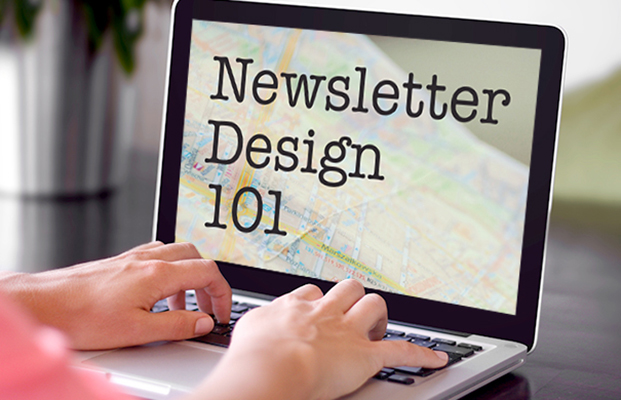
How to Design a Beautiful Missionary Newsletter in 5 Steps

missionary newsletter design
You don't have to be a graphic designer to design a beautiful missionary newsletter. Apply these 5 tips to create an appealing newsletter your supporters will love to read.

In a previous post, we shared our 10 step process to writing a memorable missionary newsletter. Now, your polished copy deserves a design that’s just as clean and appealing.

Thankfully, with email services like Mailchimp or Constant Contact, sending a beautiful missionary newsletter is easier than ever. With those resources in hand, here are my favorite tips for creating a delightful email newsletter.

How can they read it, if they can’t read it?

As a graphic designer, the biggest problem I’ve noticed with poorly designed email newsletters is that they’re just too much work to read. You might have the most captivating, well-written stories in the world, but if they are illegible to your readers, they will give up and move on to something else.

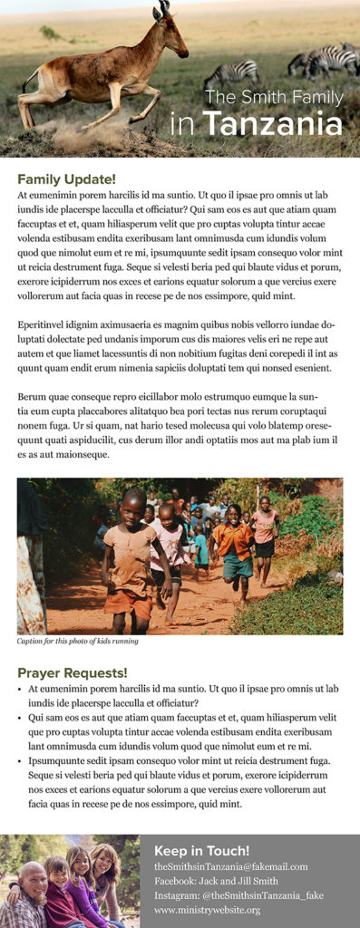
To illustrate, here is an example of a hypothetical missionary family’s newsletter:

missionary newsletter bad design

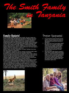
The Smiths wanted a newsletter that is more interesting than just words on a page, and they’ve done a few things to make it stand out. Unfortunately, it doesn’t stand out in a good way!

Let’s see how we can apply a few design best practices to make it better: 


missionary newsletter good design


1.  Stick to a one-column layout. 

The first thing we will eliminate is the sidebar, making the Smith’s email newsletter one column instead of two. A rising percentage of readers use a smartphone or tablet, and a one-column layout is best for viewing on these devices. For more on this, check out “Is Your Newsletter Mobile Ready?

2.  Choose your font carefully. 

Next, let’s look at font style. The folks at Mailchimp follow the mantraone eyeball, one thumb and arm’s-length” when designing emails. This is because readers on mobile should be able to read it easily with one eye, use one thumb to scroll and tap and do so at arm’s length.

To achieve this measure of legibility, you should choose a font that is simple and easy to read. Bloomberg suggests using Georgia or Verdana, as they both are easy to read on screen. They also come pre-installed on every type of computer, so there’s no risk of your reader’s machine changing the font to something else.

To keep your newsletter design looking clean, choose no more than two or three fonts — one for your main body copy and another for headlines. If you must use a “flashy” font, limit it to headlines.

In my redesigned example, I used the font Proxima Nova at various weights for the title and headings in the email. This sans-serif font (or, without feet) is a nice contrast to Georgia, but is still very easy to read.

3.  Pay attention to font size and spacing.

Your newsletter shouldn’t have any text smaller than 16px. For reference, Mailchimp recommends 16px minimum, while Apple recommends 17-22px, and Google recommends 18-22px. I used Georgia at size 16px for the body of the Smith’s redesigned email.

Pay attention to your line spacing, too. Your type might be large enough, but if the lines are too close together, it will still be difficult to read. I used a line spacing of 24px for the Smith’s updated newsletter.

4.  Color them impressed, not distressed. 

The wrong color combinations can render a good missionary newsletter illegible. In the Smith’s first example, the dark background with the light text makes reading a challenge. Save your reader’s eyes and use light backgrounds with dark text instead.

You should also avoid using many bright colors together (never use neons!) or putting text over a busy background. Read more tips about using color in this infographic.

5.  Use scaled and aligned photos. 

Choosing engaging photos is a crucial way to generate visual interest in your newsletter. To create a powerful header image with a text overlay, you can use a site like Canva. For more info, you can check out this quick tutorial. And if you’re not feeling creative, Canva even has some pre-designed templates that you can choose from.

Once you have your images, pay attention to their size and layout. In the Smith’s first missionary newsletter, the photos are not aligned correctly or scaled proportionally (they are squished or stretched). In the redesigned letter, the header and footer images extend to the full width of the email, and the image included in the newsletter body aligns with the width of the surrounding text. 

The important thing to remember is when you resize an image, make sure the “scale proportionally” option is checked. Many email newsletter services allow you to resize photos as you upload them, or you can use a free photo editing site like Picmonkey. You can also use Photoshop or download a free program like GIMP.

If you want more information about resizing and cropping, check out this tutorial from Picmonkey.

Go forth and create!

Not everyone is a professional designer, but with a little thought and effort, you can design a missionary newsletter that will draw people in to read about what God is doing in your life and on the field.


New Call-to-action


Share this article:

About the author

Rachel McDonald

Rachel McDonald is TEAM's former graphic designer based in Maryville, TN. She is grateful and honored that she gets to do what she loves and use her gifts to support the work of missionaries around the world.

19 Comments

Leave a comment
  • Hi, Rachel I am searching for different ways in helping the hurting. God’s work needs various hands of love to get his job done on the earth. This was so inspirational for me. Thanks God bless you and your team.

  • Rachel, this was so helpful. We have been to Kenya many times and as support gets harder and harde to raise, I feel like we should be more ‘organized’ in our communication with our donors. The problem I have is like many of us, my gifts are not in design and I have very sketchy service to be able to crop pics, shape up , so to speak, the information we want to share. Time is rarely available to spend on newsletter construction but I realize how important it is and how much it means to us to have support spiritually. Aside from asking a willing person to construct the newsletter from I information we provide, have you got any suggestions. It has to be somebody that we are very close to even at that, because we want it to be personal , ‘ and from us’. Thanks for more advice .

    • Hi Sandy! Thanks for reaching out!

      Actually, having someone volunteer to put it together for you is a great idea! All you would have to do is write the content and send the photos you want to use. That still keeps it from you, but someone else is just putting it together.

      Another alternative is to take some time to set up a template that you then replicate for future emails.That takes a little more time up front, but makes it easier down the road.

      My other advice is to just keep it simple! One example of this is to send short updates more frequently. Instead of saving everything up for a massive newsletter, send one picture with a short paragraph update whenever you think of it.

      I hope this helps! Check out some of our other posts, including 10 Steps to Writing a Memorable Missionary Newsletter and How to Write an Awesome Support Letter for more tips on connecting with supporters.

  • Hello Rachel,
    I have 2 questions:
    1) How did you create the footer with the family picture and background?
    2) I don’t have the font Proximity Nova. How is it possible to add it?
    Thanks a lot for your help to all of us!

    • Hi Chris,
      Thanks for your questions! As for the first one, I will email to get some more details about which email system you are using so I can better answer you.
      For question number two, Proxima Nova is a font you can download, but it does cost. I suggest using a similar sans serif (without feet) font in whatever email system you are using.
      Hope this helps!
      Rachel

      • Hello Rachel, thanks for the quick reply, I use Mail or Firstclass. But this time, I did everything straight from Mailchimp. And I’m about to send our first newsletter with Mailchimp in a minute.
        What you did here is great and clear. Thanks a lot!
        Blessings!

  • One more thing I would like to ask. Since there is no BCC, my question would be, when the receiver get the email will see all the email addresses of my list ot not?
    Thanks for your help.

    • No, nobody will see the email list. You can send a test email to yourself and you can see what the actual email will look like.

  • Hi Rachel. do you know where can I see some examples of a support letter? also I cannot find a place to get a template for prayers cards. Any help is very appreciated!! Blessings!

  • Thank you for this helpful list! I write two newsletters for myself and two for our organization and this was very helpful. No fluff – just straight up great advice!

  • Hey Rachel,

    The steps discussed in coming up with a well structured newsletter to partners or donors are very essential. It’s a great help to developing the skill of writers.

  • I live in a high security location and have to block out the faces of my friends in my newsletter. I have seen some ppl use emojis to do this and some use the blur tool. I am wondering which one is preferred. The blur tool sometimes just makes the person look deformed or like a burn victim but the emojis feel a little childish. What do you suggest?

    • We generally use a soft blur or just a gray circle, but it’s really up to you and the tone of the rest of your newsletter. Another idea is to use creative angles in your photos, like take them from behind your friends’ heads so that your face is showing but not theirs. You can also show folks engaged in activities from a distance (be careful though not to show locations if that’s a security risk), or show people in silhouette. I hope that helps! Many blessings to you.

Leave a Reply

Your email address will not be published. Required fields are marked *